ThunderStashGaming
New member
Hello Friends,
As we look ahead to the Nintendo Switch 2, I thought it’d be fun to discuss an aspect of physical game media that I think could be improved with relative ease: the box art—specifically the spines.
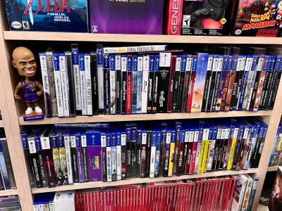
Right now, Switch spines are just plain red with white text, which gets the job done but doesn’t bring much personality to a collection and is a downgrade over previous Nintendo generations. Compare that to PlayStation 4 or 5 games, where the spines often feature unique fonts or logos that reflect the game’s style. That little touch makes a big difference—it gives each game its own identity on the shelf and makes collecting physical games more rewarding.
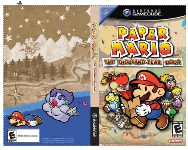
I think it’s time for Nintendo to step up and add some personality to their spines. They’ve already proven they can go above and beyond with box art when they want to—just look at the alternate covers they’ve offered through Club Nintendo for Paper Mario: The Thousand-Year Door (picture below) or Super Mario RPG Remake. Imagine if they brought that same creative energy to the spines of their games!
I’m posting a few pictures here as examples:
As we look ahead to the Nintendo Switch 2, I thought it’d be fun to discuss an aspect of physical game media that I think could be improved with relative ease: the box art—specifically the spines.
Right now, Switch spines are just plain red with white text, which gets the job done but doesn’t bring much personality to a collection and is a downgrade over previous Nintendo generations. Compare that to PlayStation 4 or 5 games, where the spines often feature unique fonts or logos that reflect the game’s style. That little touch makes a big difference—it gives each game its own identity on the shelf and makes collecting physical games more rewarding.
I think it’s time for Nintendo to step up and add some personality to their spines. They’ve already proven they can go above and beyond with box art when they want to—just look at the alternate covers they’ve offered through Club Nintendo for Paper Mario: The Thousand-Year Door (picture below) or Super Mario RPG Remake. Imagine if they brought that same creative energy to the spines of their games!
I’m posting a few pictures here as examples:
- Pic 1: My Switch shelf (functional but lacking variety) with The Club Nintendo alternate cover for TTYD among the sea of red.
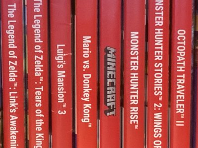
- Pic 2: A PlayStation game shelf (notice how the spines stand out).
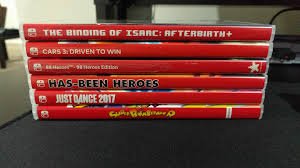
- Pic 3: Custom Spine artwork from the r/SwitchSpines group.
- Pic 4: Paper Mario TTYD Club Nintendo printable box art.